Flexbox is one of the most robust layout systems, but it is truly overwhelming for beginners. This article will provide you a comprehensive understanding of the flexbox system and how to use it to build a flexible and responsive layout.
To use flexbox, in your website, you need to include the following CSS:
.selector {
  display: flex;
}
Flex Direction
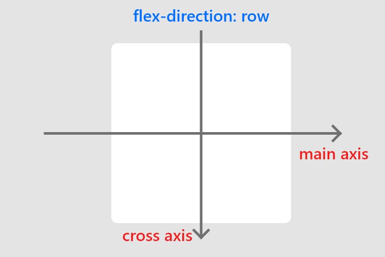
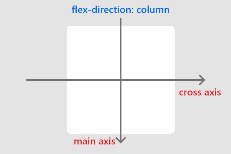
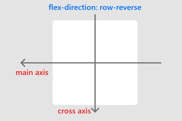
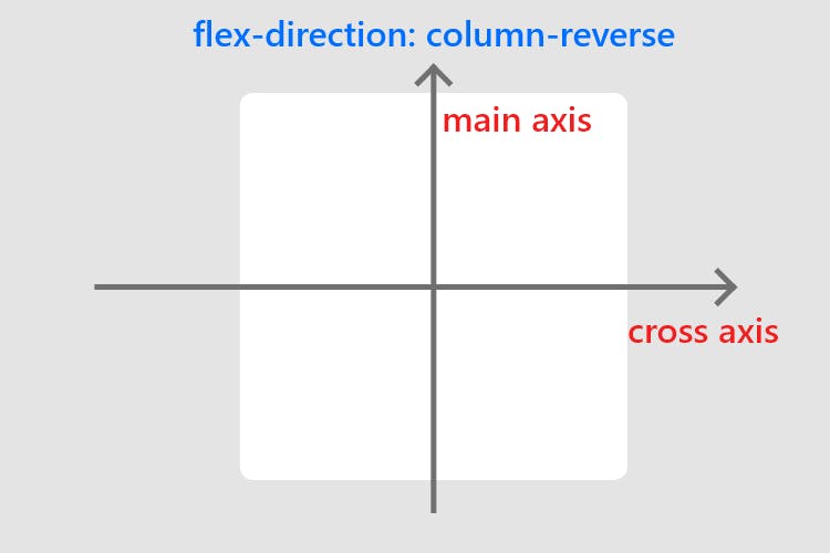
The flex-direction property controls the direction of the flex container's main axis and its perpendicular cross axis.
The main axis defines the direction flex items are placed in the flex container.
The possible values for the flex-direction property are:
row(default): Items are placed from left to right in theflexcontainer.row-reverse: Items are placed from right to left in theflexcontainer.column: Items are placed from top to bottom in theflexcontainer.column-reverse: Items are placed from bottom to top in theflexcontainer.
Justify Content
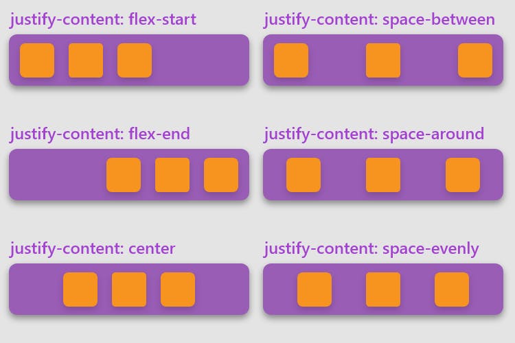
The justify-content defines the alignment along the main axis. It helps distribute extra free space leftover when either all the flex items on a line are inflexible, or are flexible but have reached their maximum size.
The possible values for justify-content property are:
flex-start(default): items are packed toward the start of theflex-direction.flex-end: items are packed toward the end of theflex-direction.center: items are centered along the linespace-between: items are evenly distributed in the line; the first item is on the start line, the last item on the end linespace-around: items are evenly distributed in the line with equal space around them. Note that visually the spaces aren’t equal, since all the items have equal space on both sides. The first item will have one unit of space against the container edge, but two units of space between the next item because that next item has its own spacing that applies.space-evenly: items are distributed so that the spacing between any two items (and the space to the edges) is equal.
Align Items
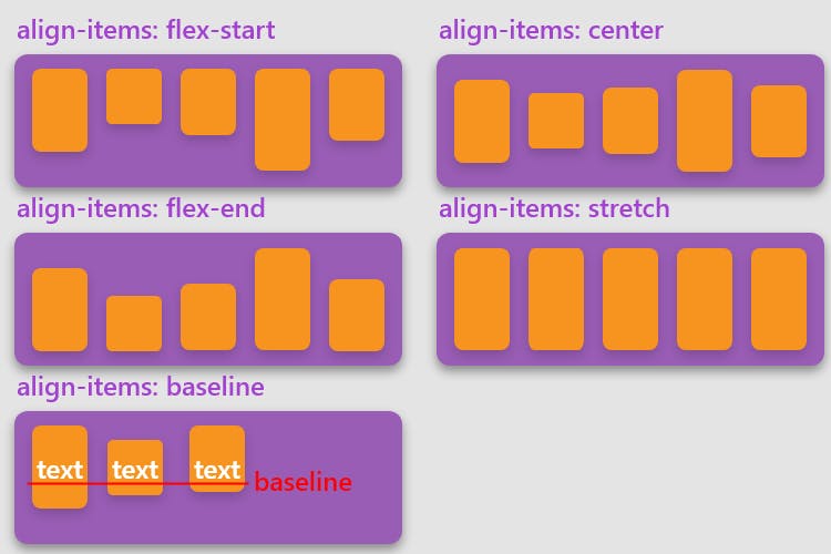
The align-items defines the default behavior for how flex items are laid out along the cross-axis on the current line.
The possible values for the align-items property are:
stretch(default): stretch to fill the container (still respect min-width/max-width)flex-start: items are placed at the start of the cross-axis.flex-end: items are placed at the end of the cross-axis.center: items are centered in the cross-axisbaseline: items are aligned such as their baselines align
Align Self
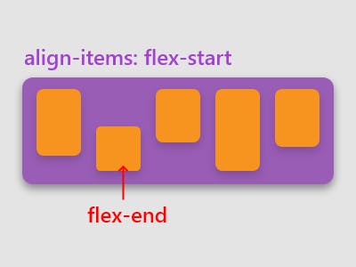
The align-self property defines the alignment for the flex item itself, on the current line, overriding the align-items property for its own flex item. The possible values for align-self are the same as align-items.
Order
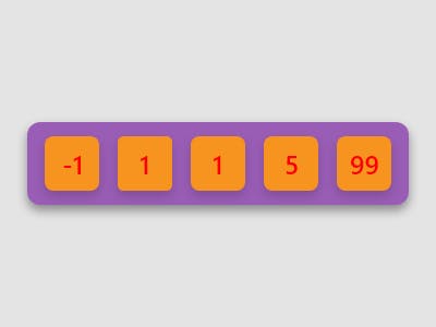
The order property defines the order of the flex item relative to other flex items on the same line. Items are sorted by order value in ascending order. It takes a numeric value (default value: 0)
Flex
flex is a shorthand property that sets the flex-grow, flex-shrink, and flex-basis properties.
The flex-grow property determines how much of the available space in the flex container the item should take up (default value: 0).
flex-shrink defines how much the item should shrink relative to the rest of the items in the flex container when there is extra space in the flex container (default value: 1).
flex-basis defines the initial size of the item, before any other properties (except order) are applied. It can be set to a particular size like 20px or left at auto.
Negative values for any of these properties are invalid.
Typically the property is to define the size of an item in proportion to other items in the flex container.
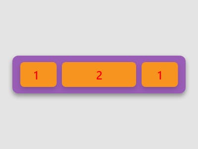
In the picture, the first & last item uses flex: 1, and the second item uses flex: 2
Flex Wrap
By default, flex items will all try to fit onto one line. This can be modified allowing the items to wrap as needed with the flex-wrap property.
The possible values for flex-wrap are:
nowrap(default): allflexitems will be on one linewrap:flexitems will wrap onto multiple lines, from top to bottom.wrap-reverse:flexitems will wrap onto multiple lines from bottom to top.
Align Content
The align-content aligns a flex container’s lines within when there is extra space in the cross-axis, similar to how justify-content aligns individual items within the main-axis. It is used in conjunction with flex-wrap.
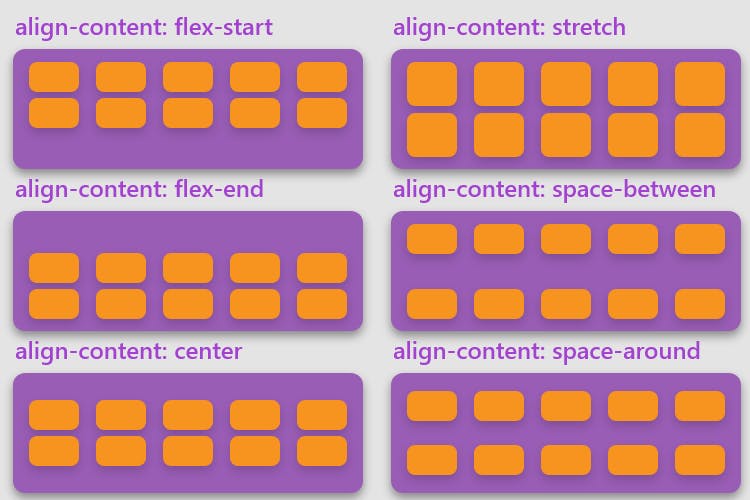
The possible values for align-content are:
normal(default): items are packed in their default position as if no value was set.flex-start: items packed to the start of the container.flex-end: items packed to the end of the container.center: items centered in the containerspace-between: items evenly distributed; the first line is at the start of the container while the last one is at the endspace-around: items evenly distributed with equal space around each linespace-evenly: items are evenly distributed with equal space around themstretch: lines stretch to take up the remaining space
Gap
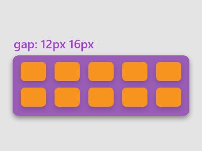
The gap property explicitly controls the space between flex items. It applies that spacing only between items not on the outer edges.
The gap property accepts one or two values. If one value is provided, it applies that gap between all items. If two values are provided, the first value applies to the space between items on the same line, and the second value applies to the gap between lines.
Wrapping Up
Now you know everything required to master flexbox! Give yourself a pat on the back!

Research says, writing down your goals on pen & paper makes you 21% to 39% more likely to achieve them. Check out these notebooks and journals to make the journey of achieving your dreams easier: https://www.amazon.com/Tapajyoti-Bose/e/B09VGDDHRR
Happy developing!
